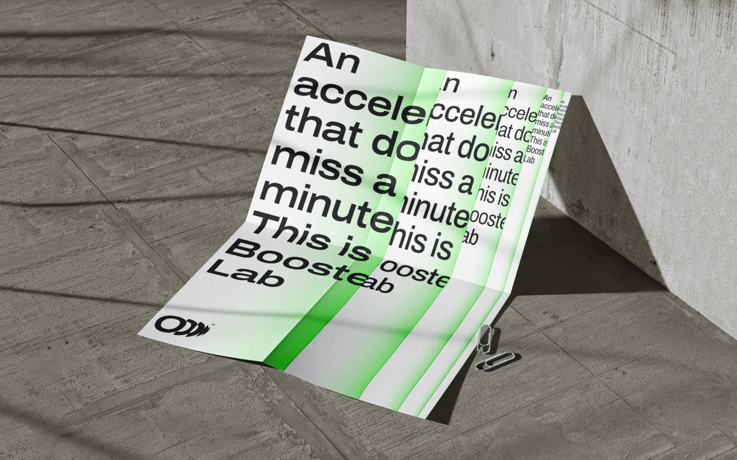
BOOSTER LAB.Inc
Feb 2023 - Mar 2023
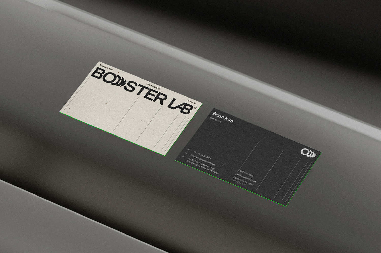
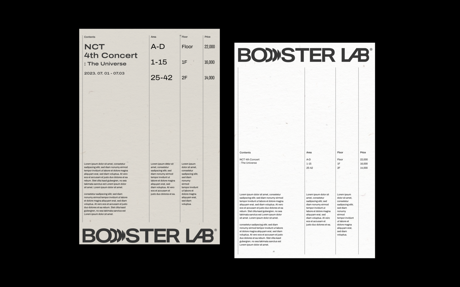
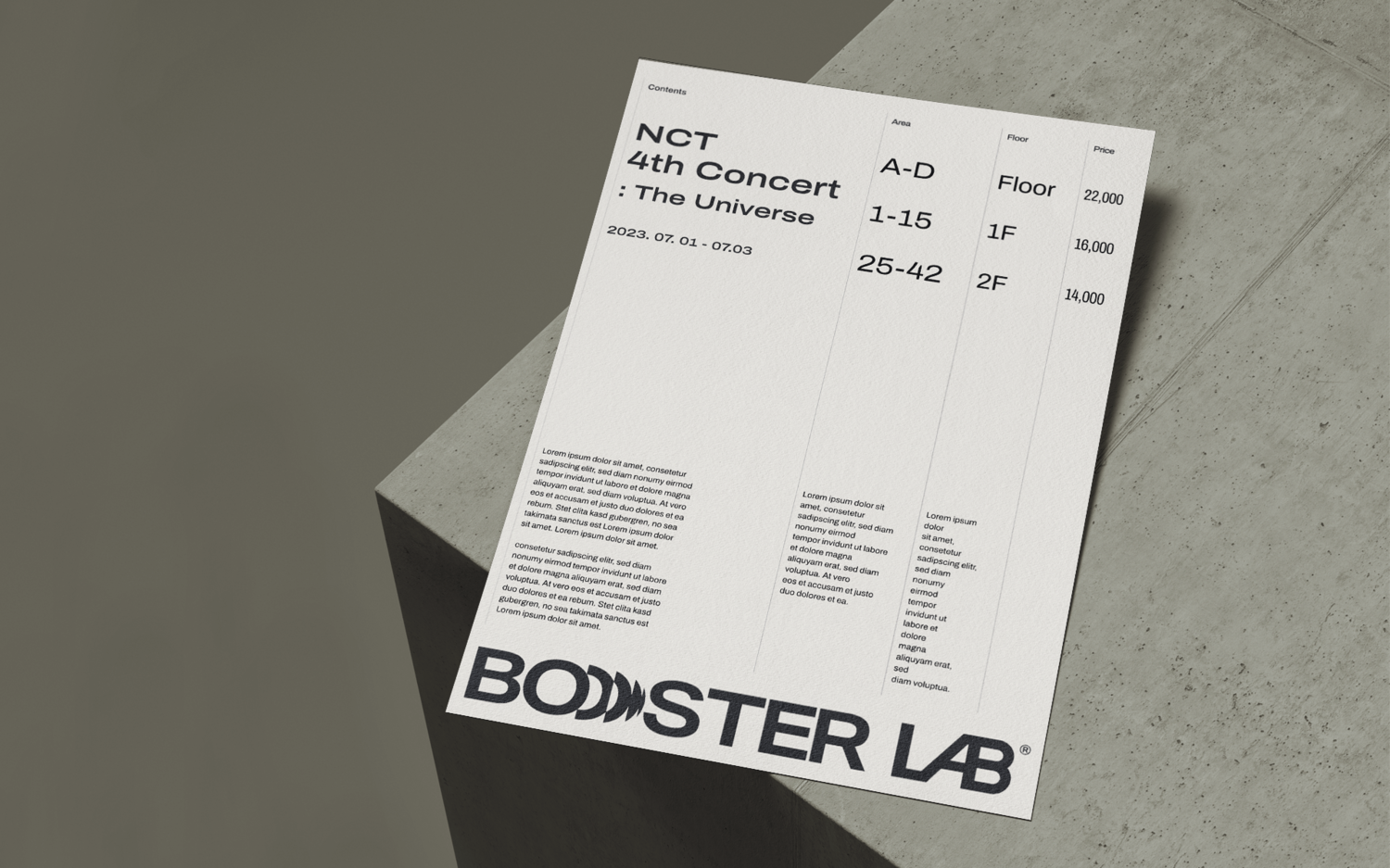
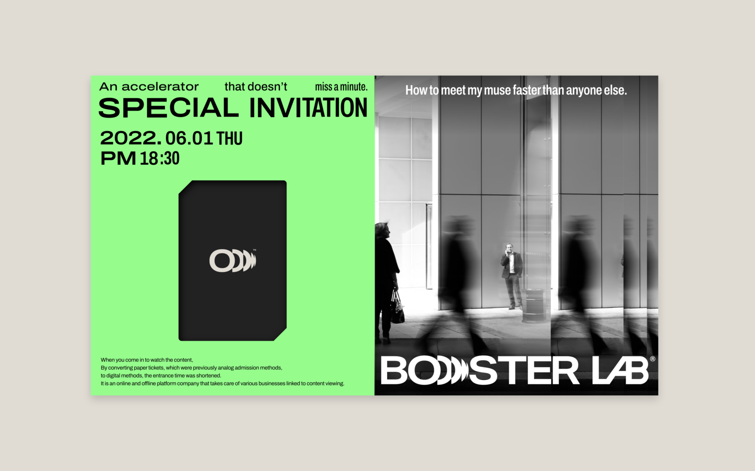
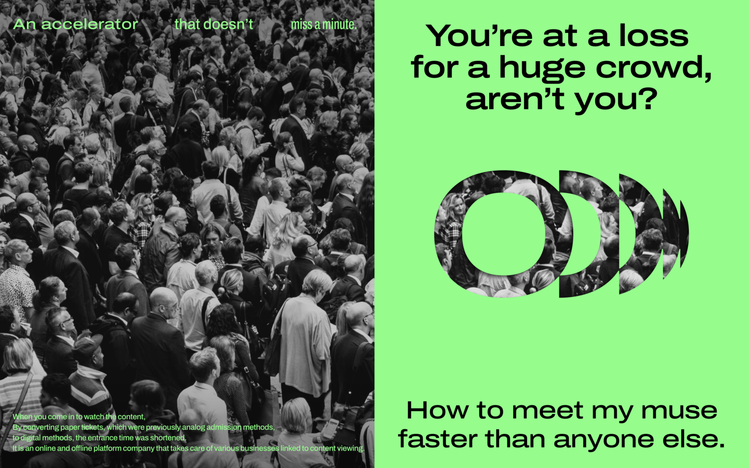
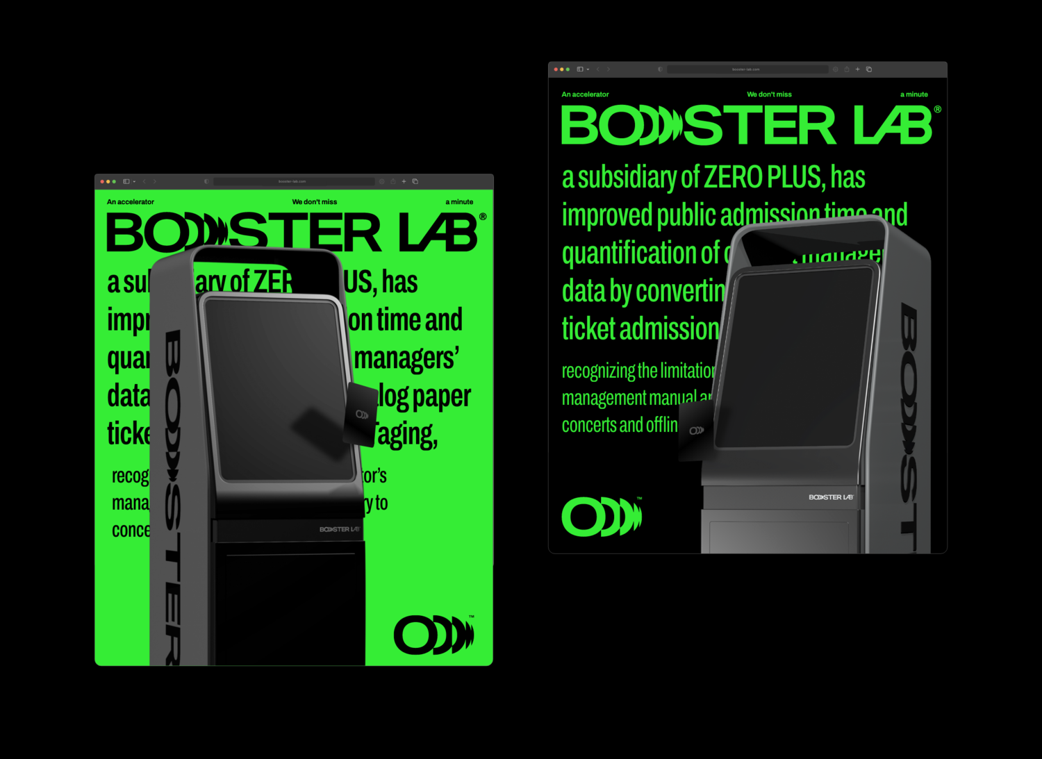
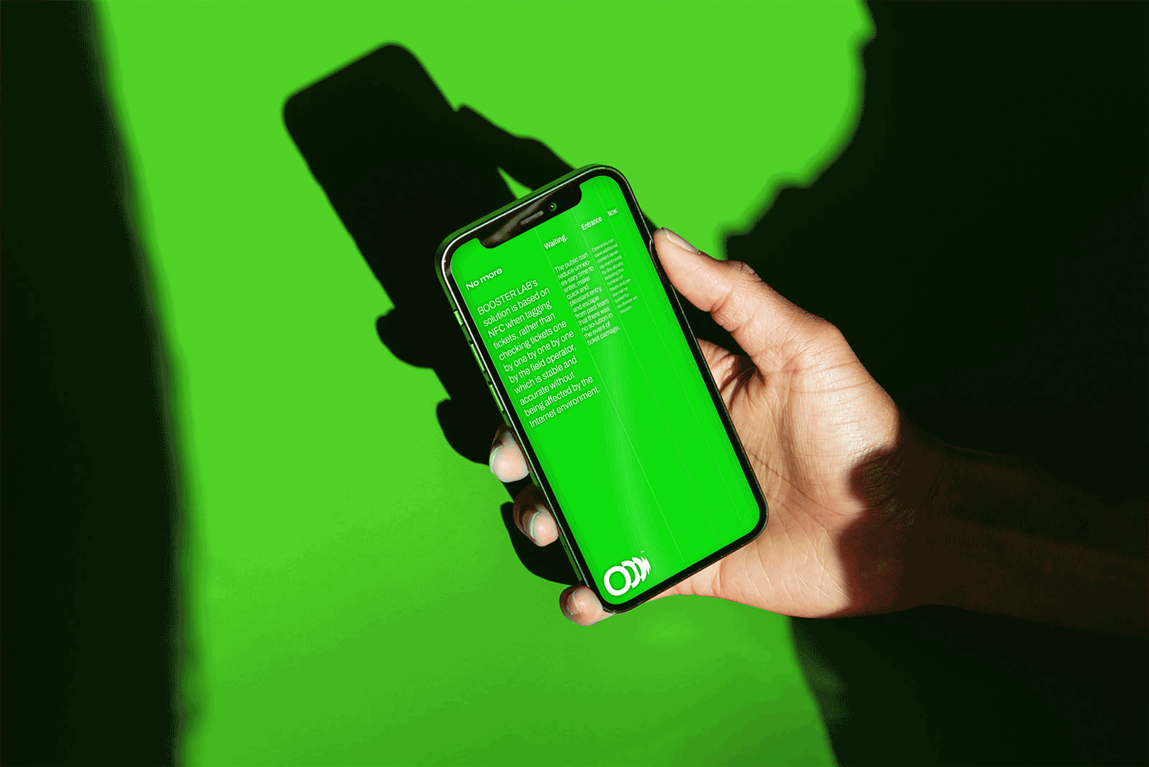
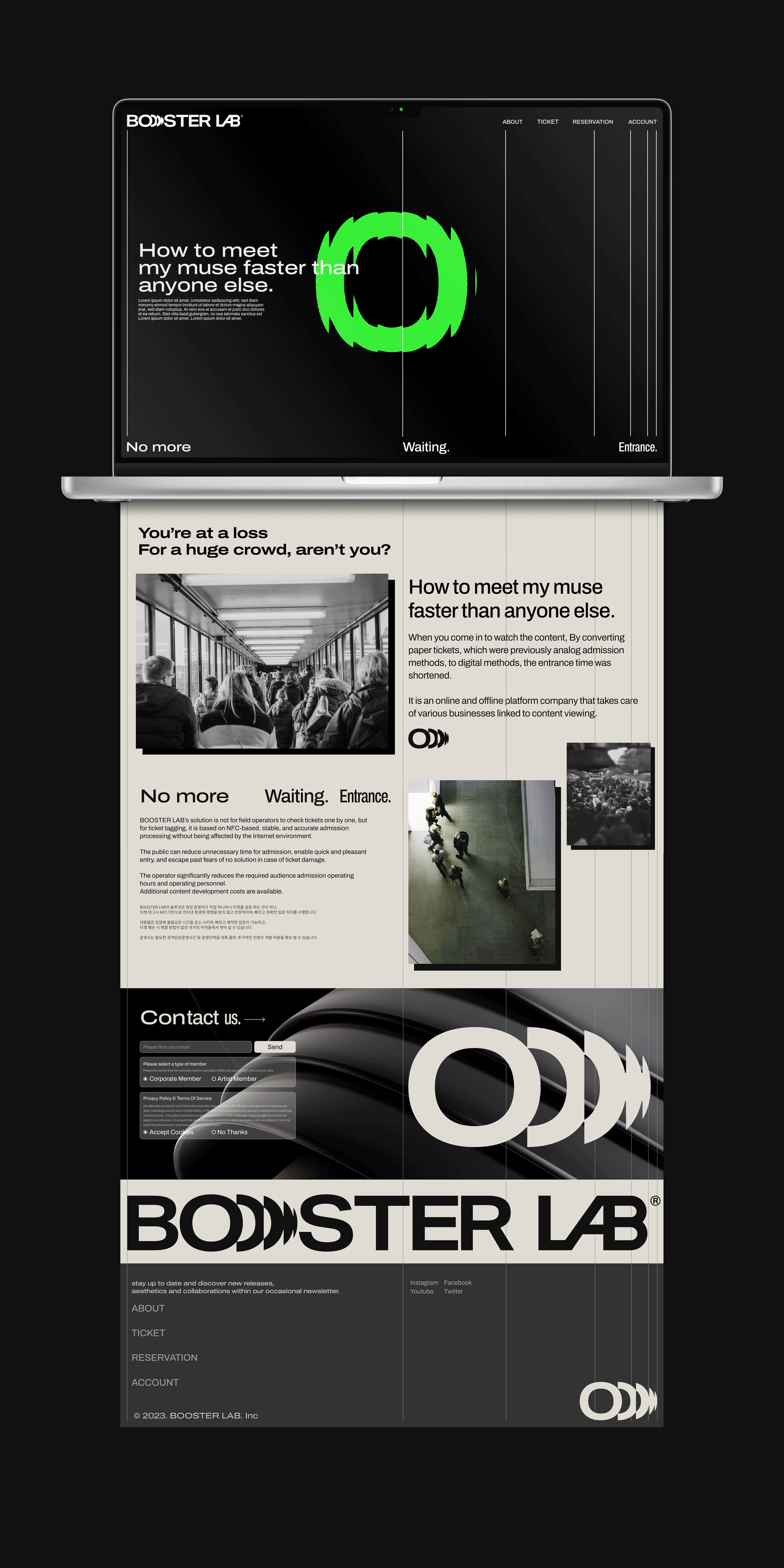
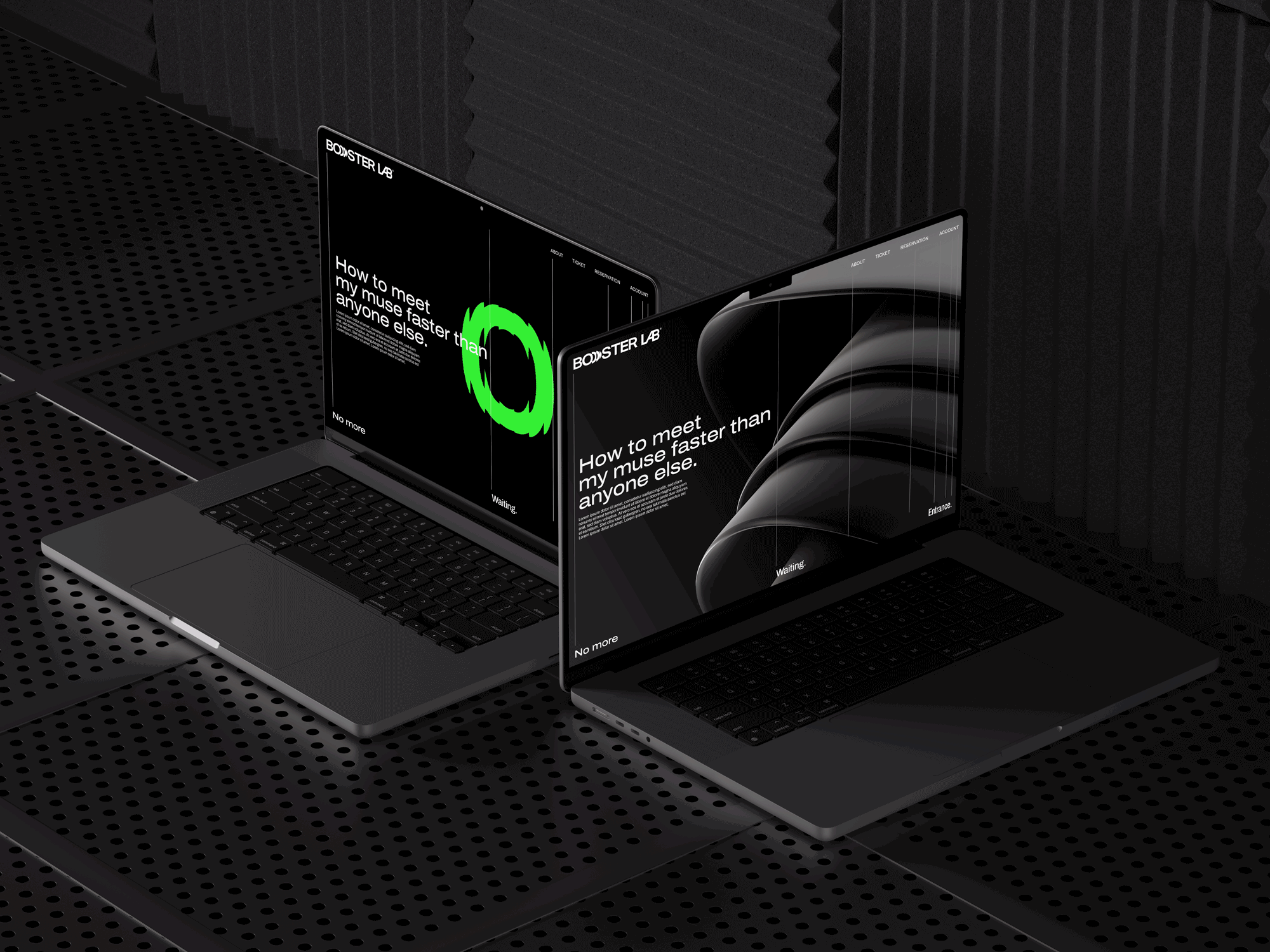
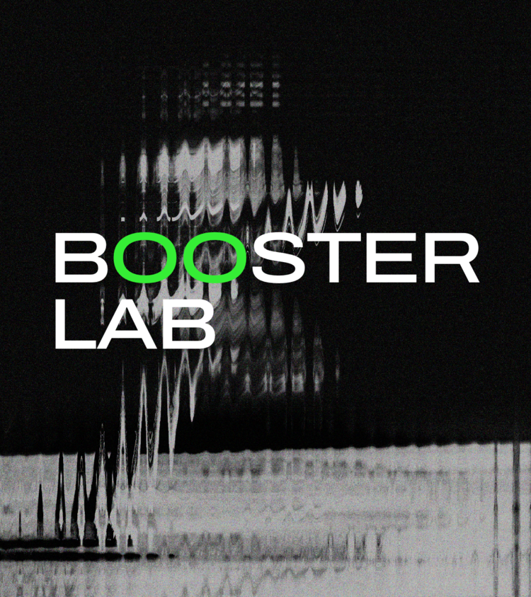
Booster Lab is a content online/offline platform company that changes the existing analog (paper ticket) entry method digitally when entering content viewing, and provides various BMs linked to content viewing. Starting with the 2023 concert, this project aims to develop brand identity based on strategy, establish visual identity for website and external platform production, and develop an asset in line with market expansion such as musicals, festivals, and sports.
부스터랩은 콘텐츠 관람 입장 시 기존 아날로그(지류티켓) 입장 방식을 디지털 방식으로 전환하면서 입장시간 단축 및 콘텐츠 관람과 연계된 다양한 BM을 제공하는 콘텐츠 온/오프라인 플랫폼 기업입니다.
본 프로젝트에서는 23년 콘서트에서 뮤지컬, 페스티벌, 스포츠 등 본격적인 시장 확장에 맞추어
전략에 기반 한 브랜드아이덴티티 개발 과 웹사이트 및 외부 플랫폼 제작을 위한
비주얼아이덴티티 정립 및 에셋 개발에 목적을 두고 진행하였습니다.
Project Approach
Identify the benefits of the solution from BOOSTER LAB and visualize the core message and vision of your business model.
BOOSTER LAB이 제공하는 솔루션의 장점을 파악하고 비즈니스 모델의 코어 메세지 및 비전을 시각화합니다.

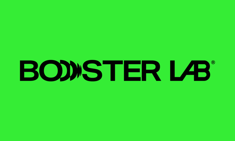

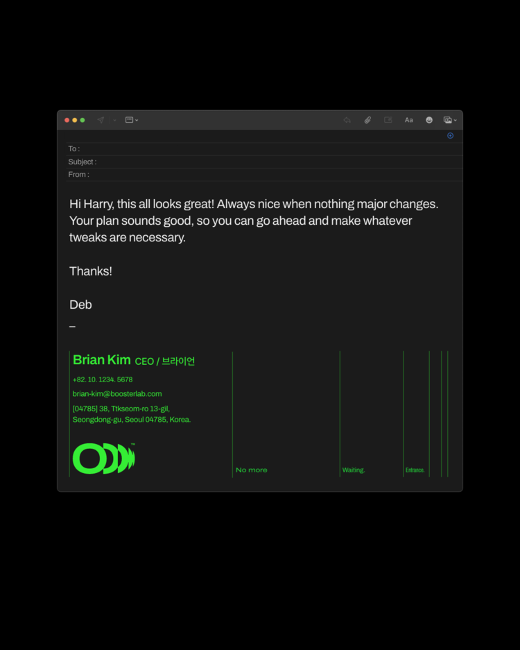
Signature Color Scheme
Develop a color system according to the characteristics and image of the business of the company.
We would like to convey the company's philosophy to present positive influence in society as a whole, such as the characteristics of services
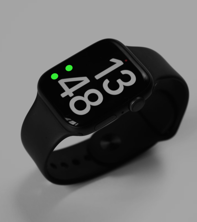
that save time by reducing waiting time for admission and planning eco-friendly material-based products for the Earth.
Focusing on Neon Green, which symbolizes technology toward humans,
we aim to utilize the Dark Theme to lower the display's heating concentration online, and the Bright Theme to minimize Ink offline.
After that, in consideration of actively utilizing recycled materials in offline packages,
we will use Eco Gray online in the same way to reduce the gap between online and offline and express a consistent identity.
기업이 가진 비즈니스의 특성과 지향하는 이미지에 맞춰 컬러시스템을 개발합니다.
입장 대기 시간을 감소시켜 시간을 아껴주는 서비스의 특성과 지구를 위한 친환경 소재 기반 프로덕트 기획 등 사회 전반적인 곳에서 긍정적인 영향력을 제시하고자 하는 기업의 철학을 전달하고자 합니다.
인간을 향한 기술력을 상징하는 Neon Green을 중심으로 온라인에서는 디스플레이 발열 농도를 낮출 수 있도록 Dark Theme를 활용하고, 오프라인은 Ink를 최소한으로 사용할 수 있도록 Bright Theme를 지향합니다.
이후 오프라인 패키지 등에서 재생소재를 적극적으로 활용할 것을 염두해 온라인에서도 동일하게 Eco Gray를 활용하여 온오프라인의 간극을 줄이고 일관된 아이덴티티를 표현합니다.